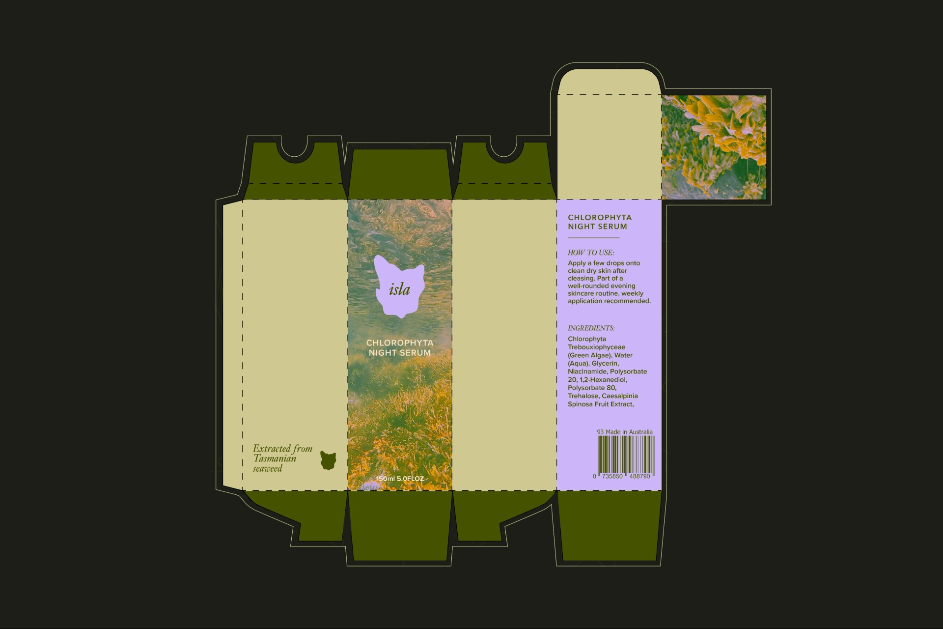
Isla Skincare Branding
Branding and art direction for a skincare brand inspired by Tasmania's wilds
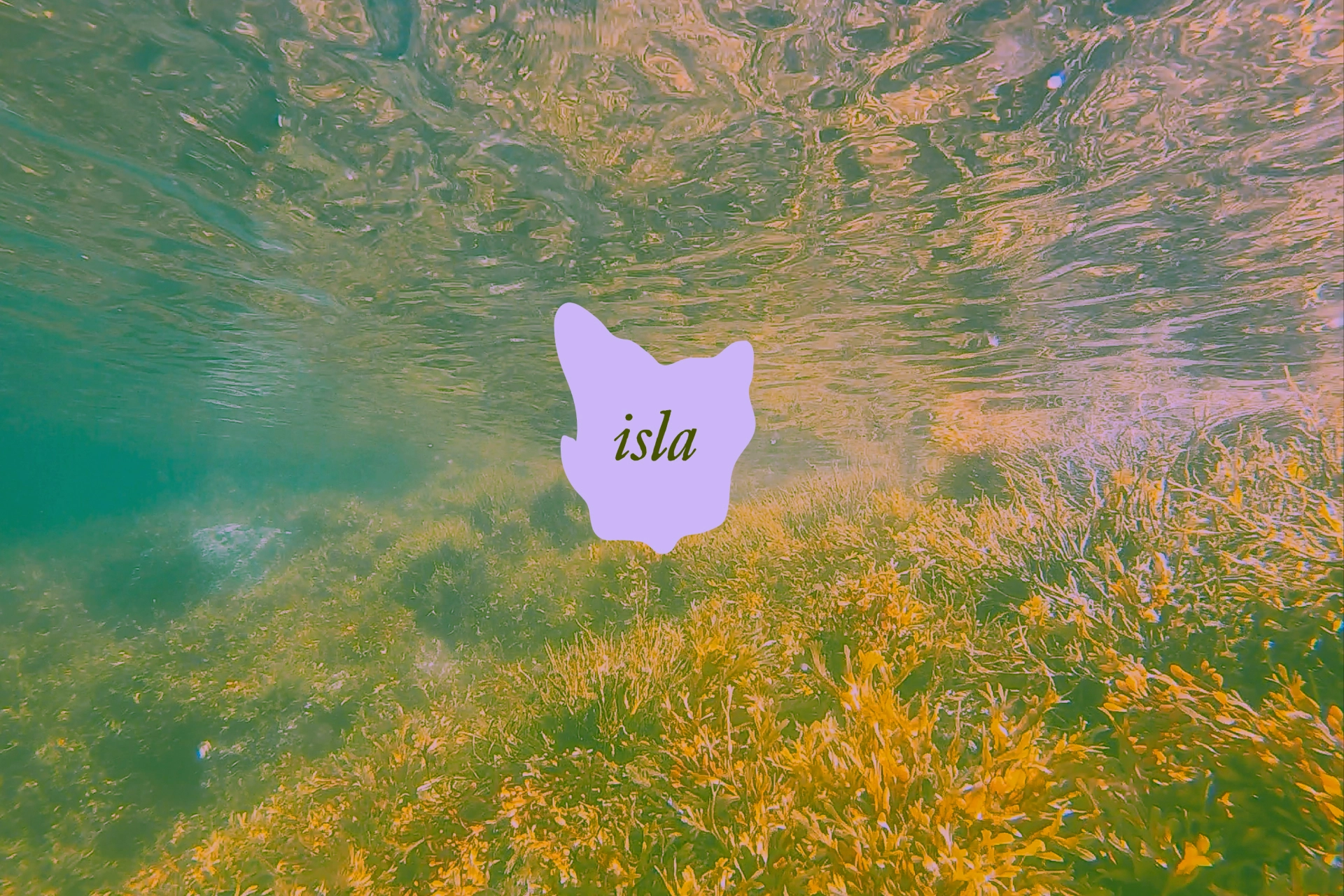
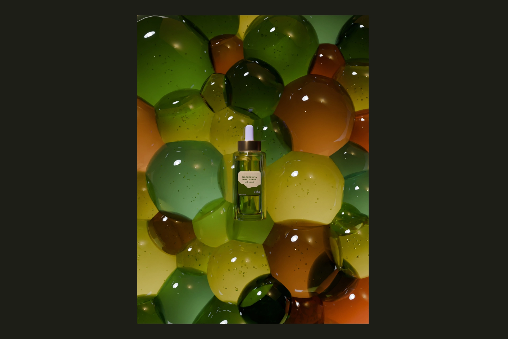
Isla's point of difference is the utilisation of sustainably sourced seagrasses grown in the pristine waters of Tasmania. The key challenge was to reflect its premium positioning and commitment to natural ingredients, without evoking any negative imagery associated with seaweed.
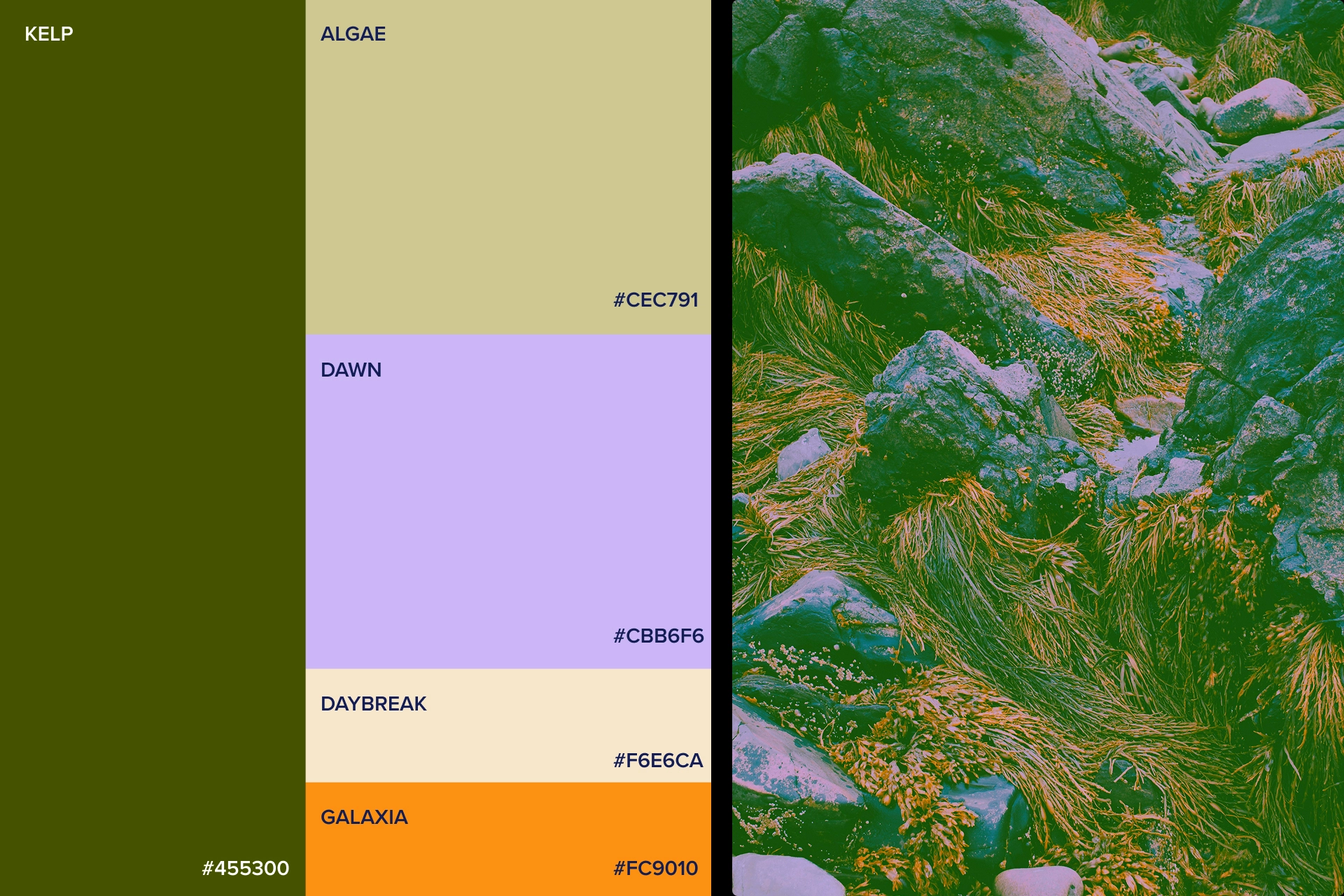
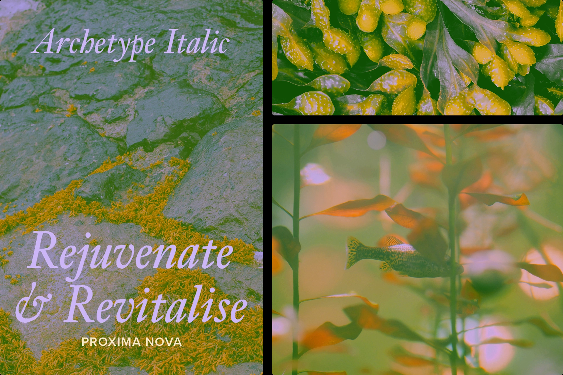
A calming colour palette evokes the tranquility of dawn and dusk, of rising and falling tides. Directly connected to morning and night when skincare rituals often take place. The brand identity heroes nature photography in all channels as homage to the inspiration behind the product. The primary typeface Archetype works alongside the secondary sans serif Proxima Nova to give Isla a scientific and nostalgic tone, supporting the brand values of being evidence based and sophisticated.